
Goals & Outcomes
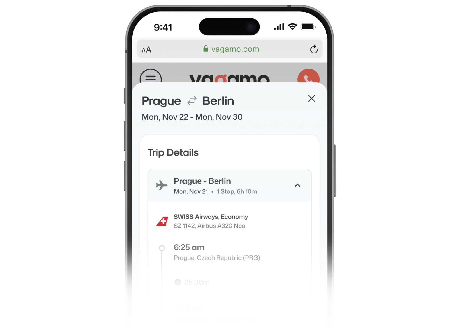
For the initial MVP, our primary objective was to validate the hybrid model. To expedite development and minimize costs, we leveraged existing flows from our other products, OOJO and ASAPTickets. This included reusing not only the logic but also the design and interactions, effectively adapting the existing codebase and development framework of OOJO with minor adjustments to align with Vagamo’s new brand principles.
The main goal was to validate a Semi-OTA business model that combines independent online booking with human-assisted travel service. Instead of investing in a completely new product from the beginning, we launched an MVP in three months using the proven booking logic and technical foundation of an existing travel product. This allowed us to test the business model with real users while keeping the initial development investment under control.
Within three months, we successfully:
- Launched Vagamo, a branded hybrid model for flight ticketing;
- Adapted legacy flows from OOJO (OB) and ASAPTickets (C2B) with a fresh design approach aligned with our new brand;
- Within the first months after launch Vagamo’s hybrid model validated, with C2B generating significantly higher profit margins. On average, Call to Book revenue was over 60% higher than Online Booking revenue per booking;
- Established a foundation for Vagamo as a distinct product with a sustainable and competitive hybrid model within the Trevolution group.
After redesign, we managed to:
- Improve conversion rate from search to booking (1.05% → 4.81%);
- Increase the average “Call to Book” conversion rate on all steps (0.86% → 2.76%);
- Created adaptive “Ancillaries” services in the booking flow to convince the user of additional services for the booking, helping get an additional $144K ARR to our bookings.
In addition to main booking ARR
Revenue per user booking raised
Months to launch MVP to test the hypothesis
Overview
Vagamo is a hybrid online travel agency that allows users to book flights independently or receive help from a professional travel agent.
As a product of Trevolution that had strong Call to Book products such as ASAPTickets and Skylux Travel, while OOJO represented the online booking direction. We’d seen that user behavior was shifting toward online booking, but assisted booking still created stronger business value and gave customers a more personalized service experience. Vagamo was created to explore the space between those two models and test whether users would respond to a travel product that gave them both digital speed and human support.
Challenge
The main challenge was to validate a new product and business model quickly without spending months building everything from scratch. The first version had to rely on legacy code and existing product logic, while still feeling credible enough to attract real users and generate meaningful data.
Once the concept was validated, the challenge changed. Vagamo needed to become a more independent product with its own identity, interface, user experience, component system, and technical foundation.
MVP Approach
We approached the first release as a business model experiment, not as the final version of the product.
The team reused the booking engine and proven flows of an existing product, adapted the most important screens to the Vagamo brand, and focused development on the functionality required for a real market launch.
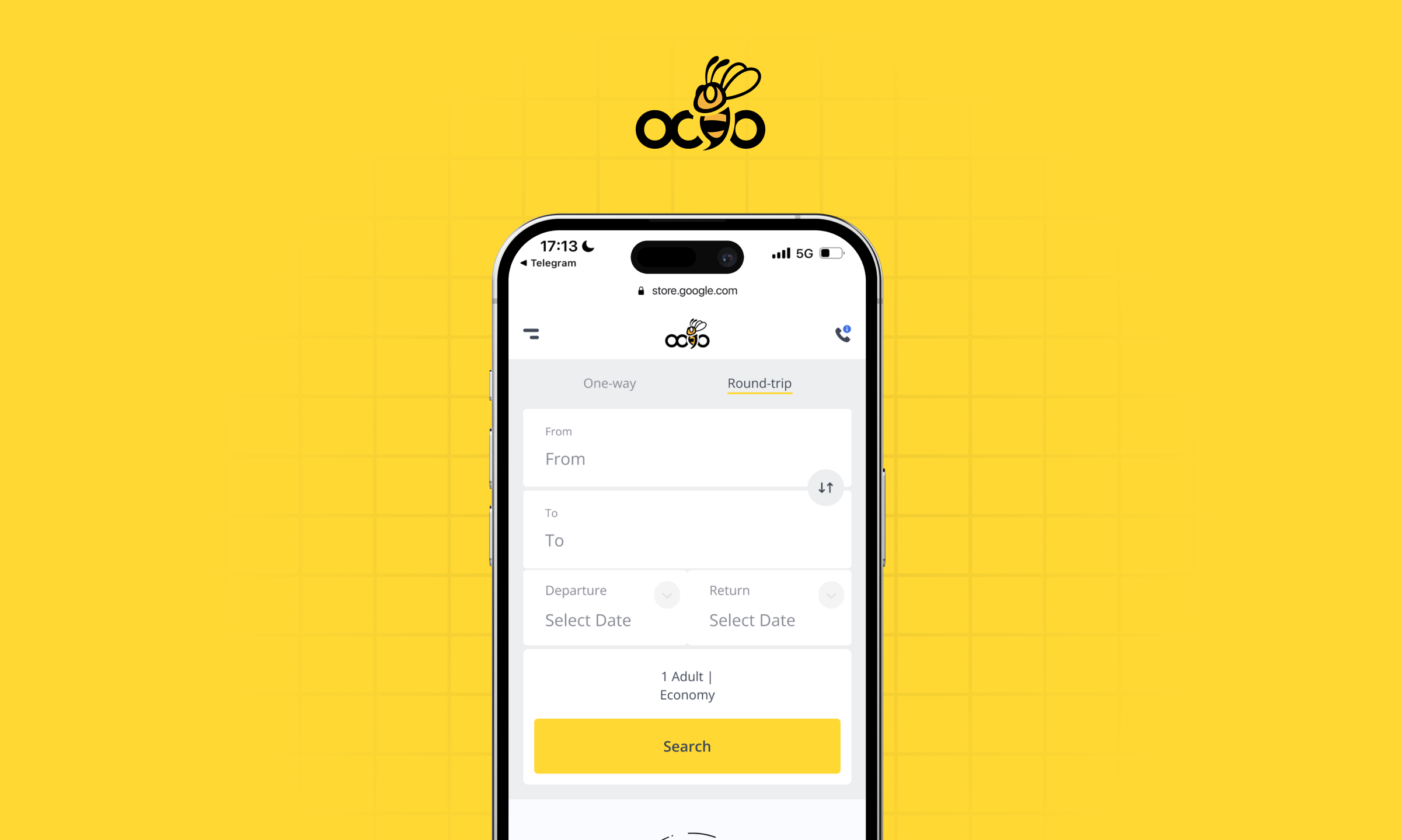
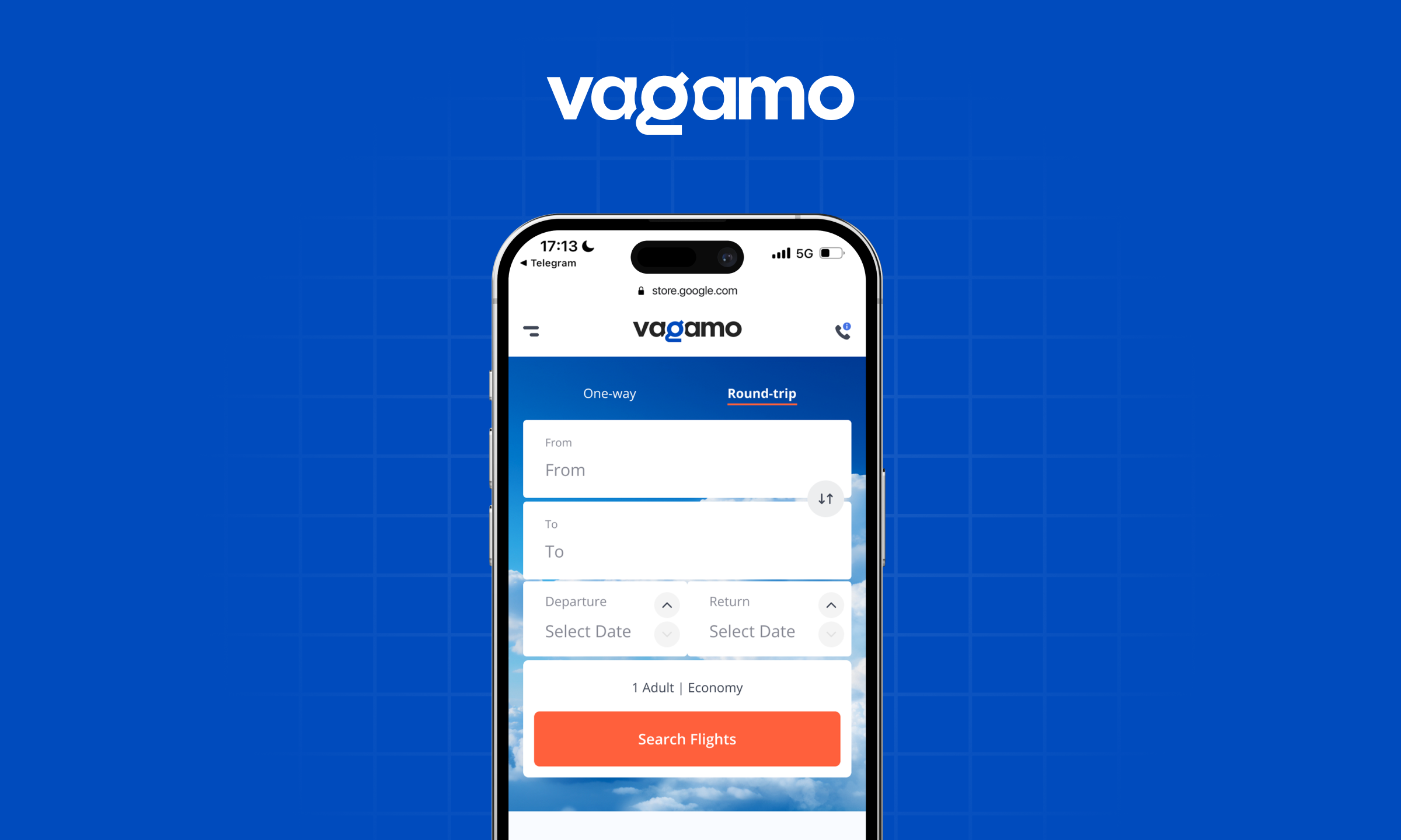
This approach allowed us to launch in three months, collect behavioral and commercial data, test the balance between Online Booking and Call to Book, and avoid investing in a full redesign before we knew whether the concept could generate value.
Key Decisions
Reuse before rebuilding. We used an existing technical foundation to reduce development time and reach real users faster.
Validate the model before polishing the product. The first release focused on proving the value of Semi-OTA rather than creating a perfect interface.
Treat Call to Book as a product feature. Assisted booking was integrated into the user journey instead of being presented only as an alternative contact method.
Use real behavior to guide the redesign. Product analytics and experiments became the foundation for the new UX, visual identity, and feature roadmap.
User Flow
The Vagamo journey supports two connected booking paths.
Users begin by searching for a flight, reviewing available itineraries, and comparing prices on the results page. They can continue through the standard Online Booking flow and complete the purchase independently.
At selected moments, users are also introduced to the Call to Book flow, where a travel agent can offer additional assistance, more flexible service, or access to a better deal.
The main UX challenge was to make assisted booking visible and valuable without interrupting users who preferred the standard online experience.
First Assumptions and Tests
Our first assumption was that users would be more likely to call if the value of assisted booking appeared during the moment of comparison. The results page became the main testing environment because this is where users evaluate prices, itineraries, and available options. We tested different ways of presenting Call to Book and measured how visibility, format, and perceived value affected user behavior.
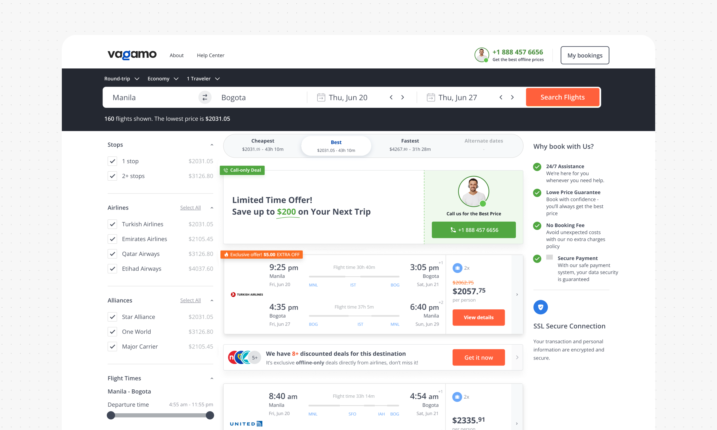
Call to Book (C2B) Banner on Result Page
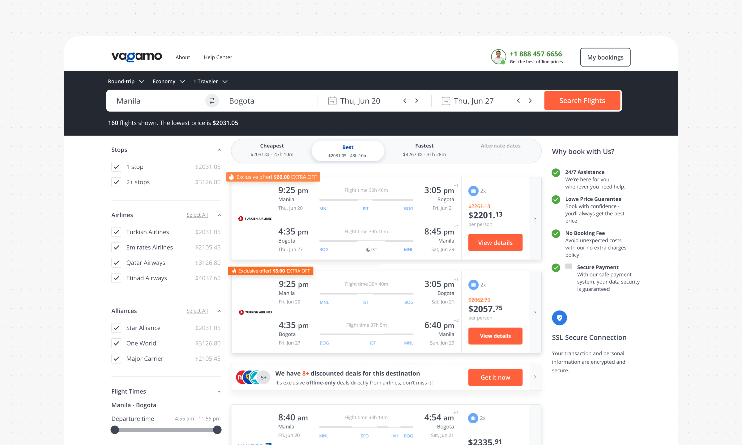
Unlike the original product experience, we replaced the first flight card on the results page with a Call to Book banner featuring a travel agent and a message about potentially better prices.
The banner placed assisted booking directly inside the list of available offers, where users were already comparing their options. This experiment produced an average 1.8% uplift in call conversion, confirming that the results page was an effective place to introduce the service.
“Mimic” Call Only Deal Banner on Result Page
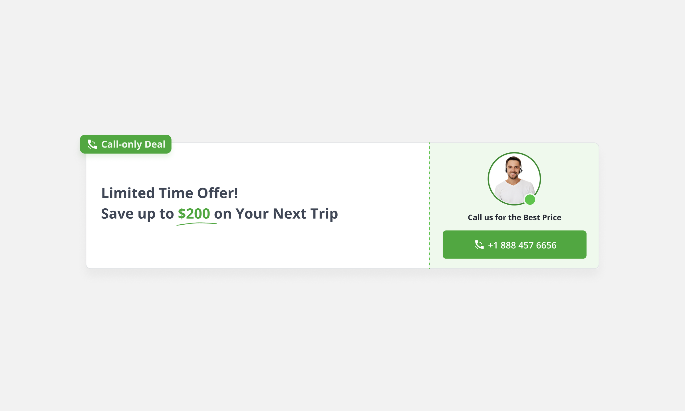
While reviewing user behavior, we noticed signs of banner blindness. The Call to Book offer was visible, but its promotional appearance made it easy to ignore.
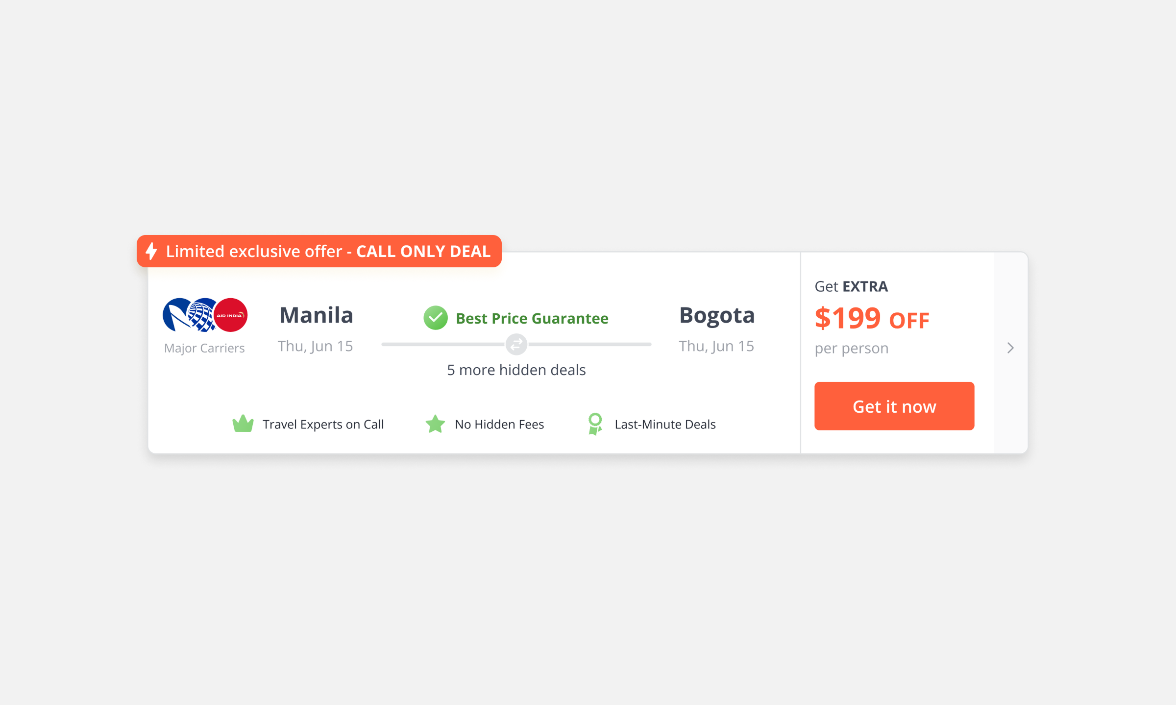
For the next experiment, we redesigned the same offer to look like a standard flight itinerary card. When users selected it, they saw a modal explaining that a better deal was available through a travel agent.
Matching the visual language of the surrounding content increased the click rate from 0.86% to 8.36%. The experiment demonstrated that users were significantly more likely to explore assisted booking when it appeared as a natural product option rather than as advertising.
So What We Learned?
The initial experiments confirmed that the Semi-OTA concept was commercially viable, but simply making Call to Book available was not enough.
Users needed a clear reason to choose assisted booking. The strongest results appeared when the call option was connected to a tangible benefit such as a better price, additional service, expert assistance, or a more flexible booking experience.
We also learned that Call to Book performed better when it was integrated into familiar product patterns. Instead of presenting the call as an external sales action, we needed to introduce it through standard booking interactions and then explain its additional value.
Redesign Phase
After validating the MVP, we started transforming Vagamo into a standalone product. The redesign introduced a new product identity, a more contemporary visual language, improved information hierarchy, updated booking flows, and features that had been missing from the legacy experience.
At the same time, development began moving away from the inherited codebase. This gave us an opportunity to improve not only how the product looked, but also how it was structured, maintained, and extended by the team.
The redesign was guided by what we had already learned from real users, rather than by visual preferences alone.
UI Kit and Component-Centered Design
The redesign started with a component-centered foundation.
Instead of designing every page separately, we first established reusable components, interaction states, layout rules, typography, colors, spacing, and responsive behavior. This helped align design and development around the same product logic. Components were documented and prepared for handoff, which reduced interpretation gaps and made implementation more predictable.
The UI Kit became the shared foundation for new screens, experiments, booking features, and future product improvements.
Post-Redesign Hypotheses and Results
The new interface gave us a cleaner environment for the next generation of experiments. At this stage, the focus shifted from validating the overall business model to improving specific moments inside the experience. We tested how better information hierarchy, repeated value communication, persistent agent visibility, and more contextual offers could influence user decisions.
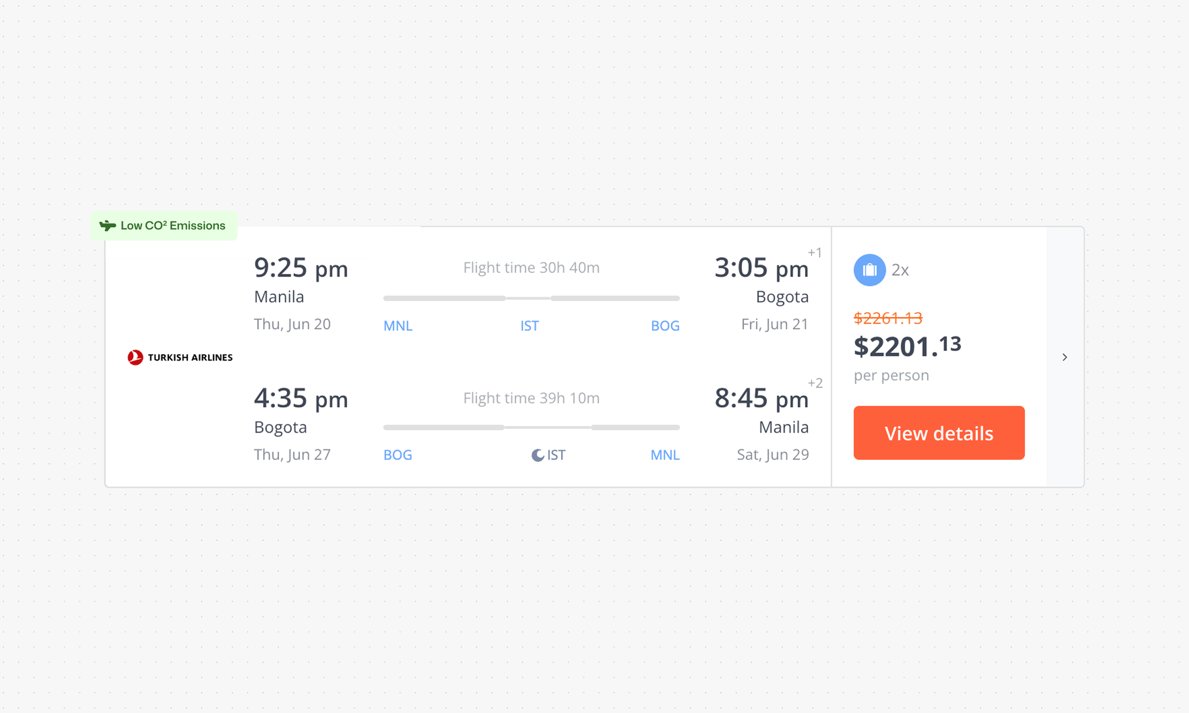
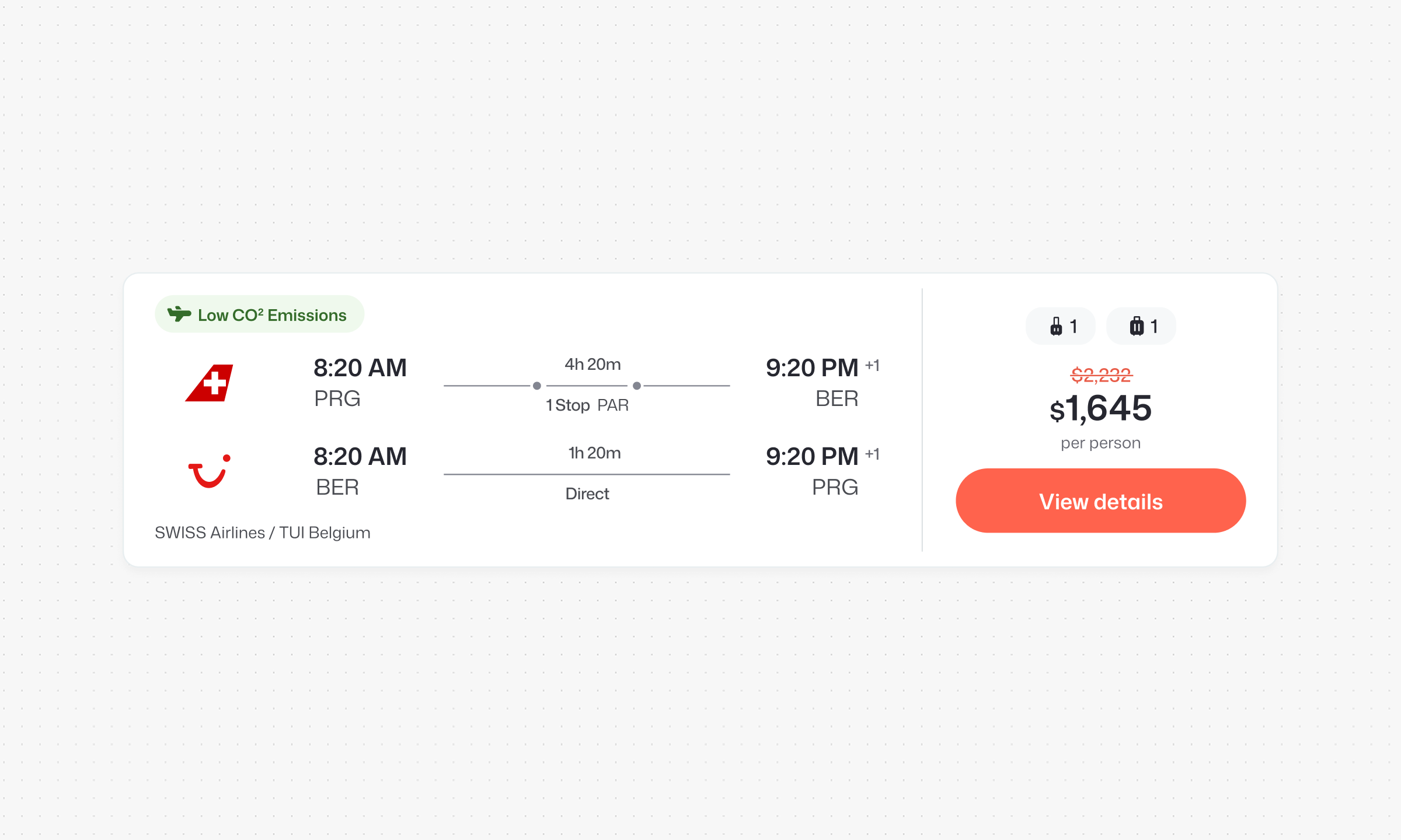
Better Itinerary Card UX & Layout
We redesigned the itinerary card to make flight information easier to scan and compare. The new layout introduced clearer visual hierarchy, stronger accents, more whitespace, improved grouping of details, and better responsive behavior across different screen sizes.
After the redesign, the average time before users selected an itinerary decreased from 5 minutes 17 seconds to 3 minutes 47 seconds — a decision made 1 minute 30 seconds faster.
Sticky High-Contrast Agent Block
We introduced a sticky agent block that remained visible while users scrolled through the results page.
The block reminded users that a travel agent could help them find a better price or provide additional booking support. High visual contrast separated the block from the flight cards while its persistent position kept the service visible during the comparison process. The experiment increased overall call conversion on the results page from 6.45% to 7.22%.
Secret Deal Modal Window
Product analytics showed that users actively engaged with modal content when it was relevant to their current decision.
Based on this insight, we designed the Secret Deal modal, which compared Online Booking with booking through a travel agent. The modal explained the additional value of assisted service through practical benefits, including access to special offers, expert support, and more flexible assistance. Instead of only asking users to call, the modal gave them a clear explanation of why calling could produce a better outcome.
The modal added +35 average daily leads.
What We Learned After the Redesign
The post-redesign experiments confirmed that users needed more than a visible call button. They needed relevant information, repeated value communication, and concrete examples of what a travel agent could provide. Assisted booking became more effective when its benefits were connected to the user’s immediate context and shown during important decision moments.
We also learned that the value of Call to Book should not be communicated only once. It needs to remain visible throughout the journey without becoming intrusive.
Dynamic Cross-Sells in the Booking Flow
The next initiative focused on increasing the value of the booking through dynamic cross-sell offers. The idea was inspired in part by a pattern observed in the market, including an implementation used by Kiwi.com. I adapted the principle to Vagamo’s product structure and expanded it into a progressive cross-sell flow, where the system responds to the user’s previous choices and presents a more relevant alternative during the next step.
Problem Matrix
Before redesigning the cross sell flow, I mapped the main usability issues across the Details, Services, and Payment stages, then ranked them by their impact on the booking decision.
The most critical problems were connected to missing flight information, poor readability, limited price visibility on mobile, lack of seating details, and the absence of a clear trip overview. These issues made it harder for users to understand what they were buying and increased uncertainty during the most important moments of the flow.
The matrix also revealed a second layer of friction. Countdown timers created unnecessary pressure, outdated visuals reduced trust, some icons lacked clear meaning, passenger management was limited, and payment options were not flexible enough.
This analysis showed that the booking flow did not need more static offers. It needed a more structured system that could present the right information and the right cross sell based on the user’s previous choices. That insight became the foundation for the dynamic cross sell concept described below.
Main Idea
The main offer was Travel Care Service, a bundled package that could include refund protection, flight insurance, baggage protection, and medical coverage depending on the itinerary. When a user declined the complete package, the booking flow did not simply remove the offer — on the next step, the system separated its value into individual products.
The user could then choose between medical insurance, refund protection, and flight insurance as independent cross-sells. This allowed us to preserve potential value even when the complete bundle felt too expensive or unnecessary for the user.
Flow Logic
The flow begins with the complete Travel Care Service bundle. When the user accepts it, the booking continues without additional offers from the same category. When the user declines it, the system records the choice and introduces selected benefits as individual cross-sells during the following steps.
This creates a progressive experience where each next offer reflects what the user has already accepted or rejected.
Design and Delivery
All new cross-sell sections were built using the redesigned Vagamo component system. I designed the offer cards, selection states, pricing logic, responsive layouts, and interactions within the new visual language. I also prepared the handoff, documented component behavior, and aligned edge cases with the development team — so design and engineering worked from the same reusable patterns while supporting multiple offer combinations inside the booking flow.
Sales Results
The dynamic cross-sell initiative increased cross-sell purchases by approximately 22%. The additional sales generated more than $100K in annual recurring revenue, showing that progressive personalization could improve commercial performance without adding unnecessary friction to the core booking journey.
Thank you for reading
If this catches your interest, we can work together ;)