
Multiproduct Design System
B2B, Multi-Product token based Design System that combines 3 different Trevolution’s products.
Goals & Outcomes
The goal was to replace fragmented interface patterns across Trevolution’s travel products with one scalable token based design system. It had to improve consistency, reduce repeated work, and allow different brands to share the same product foundation without losing their identity.
The system connected the initial product environments through shared variables, reusable components, brand specific aliases, and documented implementation rules. It became a foundation for faster white label launches and future product integrations.
Estimated annual company savings
Days to deliver a new design
Of components used from the system
Overview
Trevolution operates several travel products that share similar booking logic and technical foundations while serving different audiences. ASAPTickets focuses on budget conscious travelers who often prefer agent assistance, while SkyluxTravel offers a more premium experience for business and first class customers.
The products needed to remain visually distinct, but their teams were repeatedly designing and developing the same interface patterns. The system had to separate shared product logic from brand specific presentation.
Challenge
When I joined the project, the products had no structured shared design system. Designers recreated common patterns, developers implemented similar components several times, and visual inconsistencies accumulated across pages.
The challenge was to standardize the front end without forcing different brands into one visual style. The solution had to support existing legacy pages, new products, white label launches, and gradual migration without requiring a complete backend rebuild.
Business Case
The development team first consolidated existing interface components into one repository. This exposed duplicated patterns, inconsistent states, and repeated implementation work across the products.
Together with the Tech Lead and the Head of LeadGen Products, I mapped the main problems, prepared a roadmap, estimated the potential savings, and helped present the initiative to stakeholders. This turned the system from a visual cleanup into a measurable business efficiency project.
Approach
The work started in summer 2023 with a six month MVP target. We gathered requirements from design and development, reviewed technical limitations, prioritized components, created the system structure, tested critical patterns, documented behavior, and introduced Design QA before implementation.
The system was developed iteratively. Instead of waiting for one complete library, we delivered prioritized component groups, validated them inside real product screens, and expanded the system through active product work.
System Architecture
Figma Variables and the updated Dev Mode changed the original approach. I rebuilt the system around four connected layers that separated global product logic from brand specific decisions.
Variables
Shared collections controlled colors, palettes, spacing, sizing, and border radius. Product specific aliases connected the same semantic token to different brand values.
Foundations
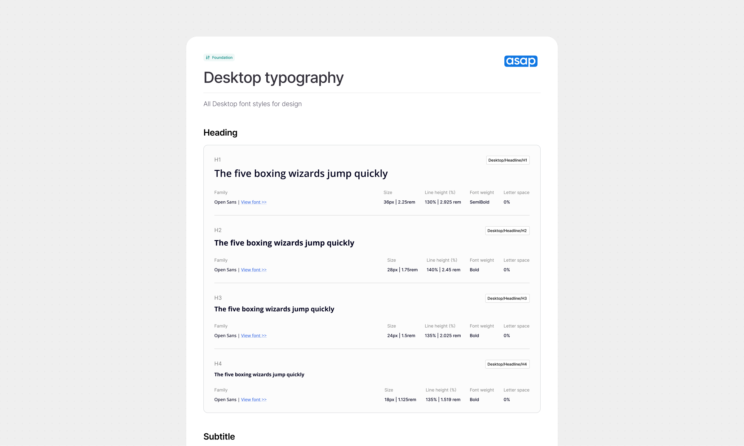
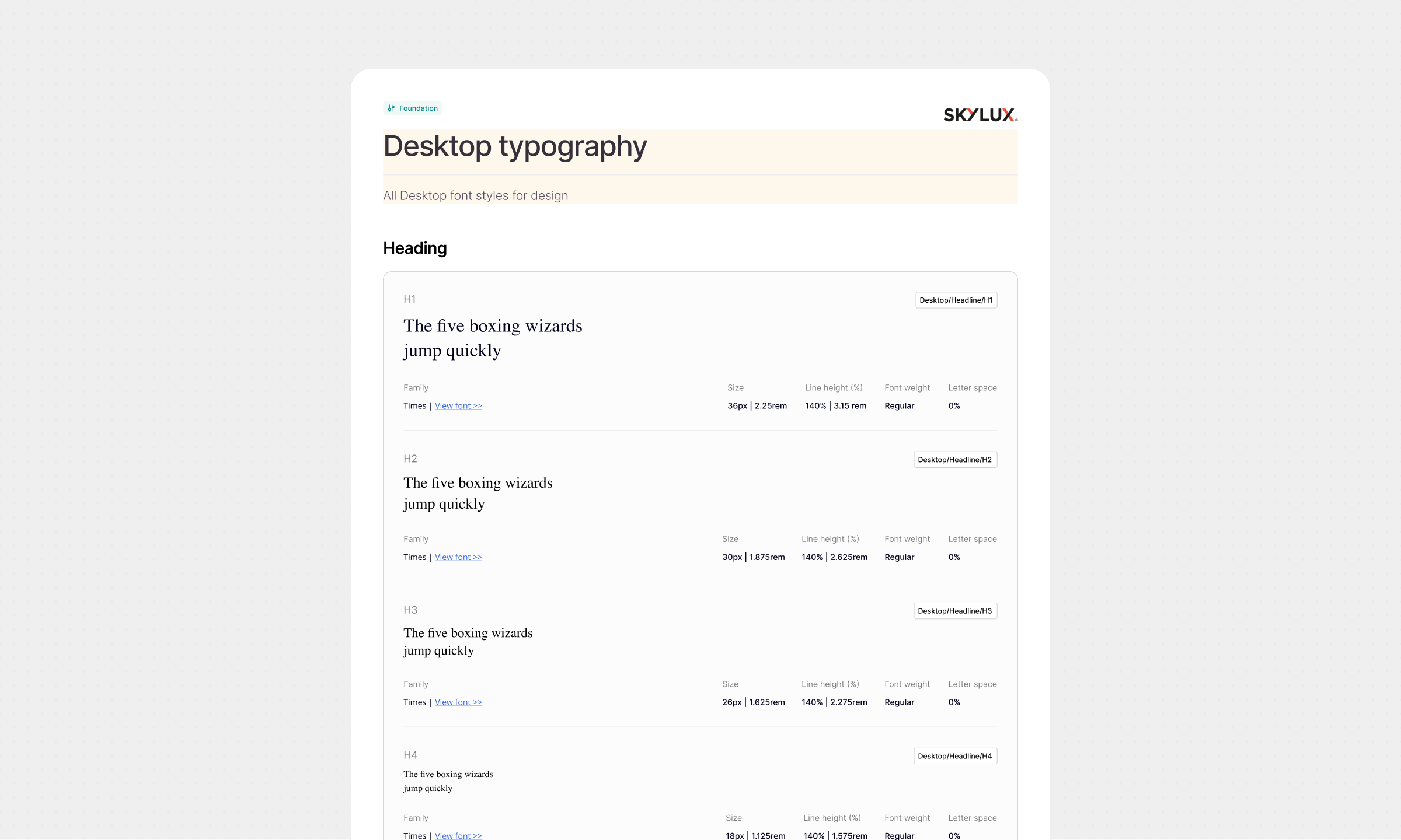
Each product received its own typography, grids, effects, overlays, and border rules while continuing to use the shared variable foundation.
Components
Product libraries were divided into basic components, complex patterns, and larger interface sections. This made the system easier to navigate, maintain, and extend.
Visual Library
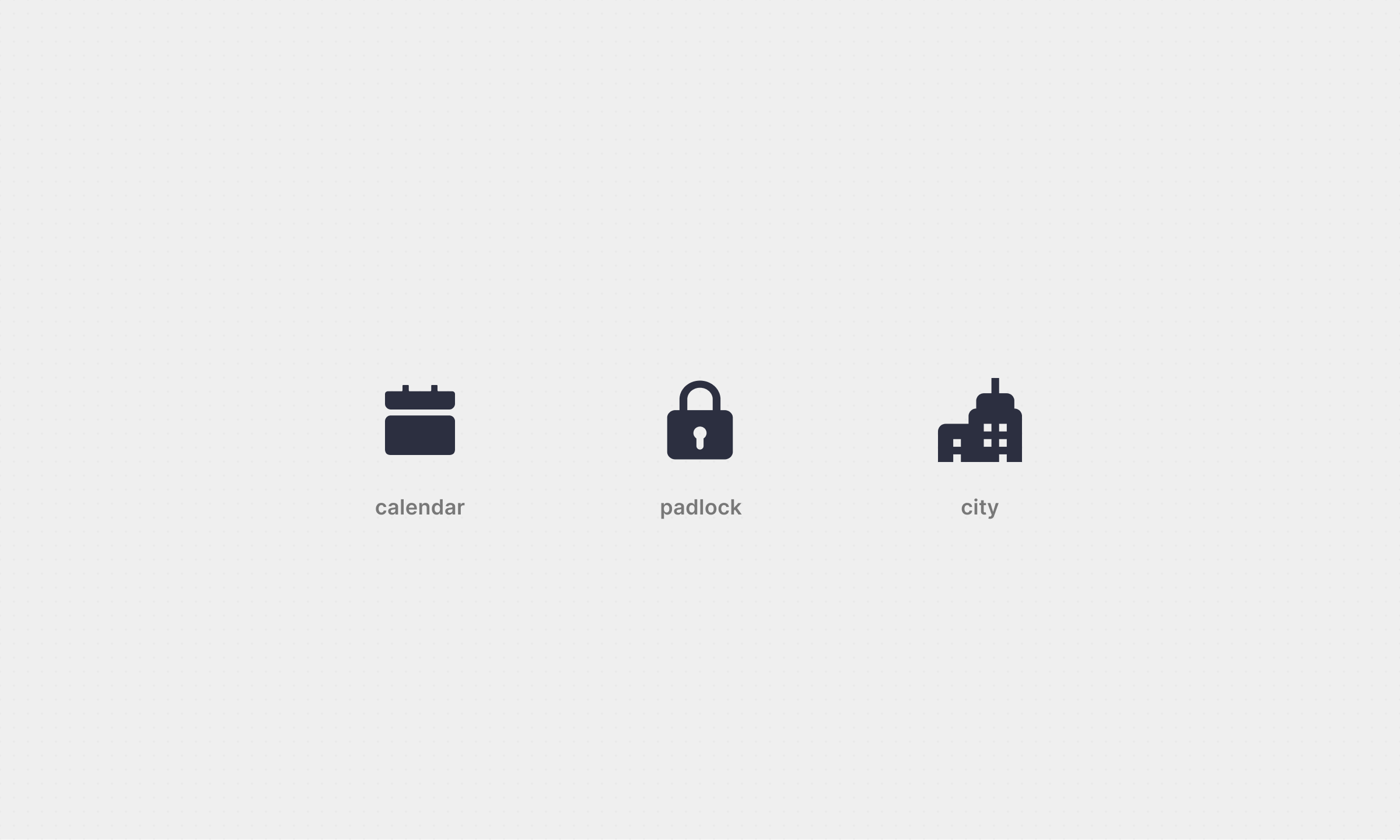
Icons, images, illustrations, and brand assets were separated into a shared visual library so teams could reuse them without mixing visual assets with functional components.
Token Logic
The system used shared variables and product specific aliases to let one component adapt across different brands. A button, input, banner, or form could preserve the same structure and behavior while receiving the correct colors, typography, spacing, and visual treatment for each product.
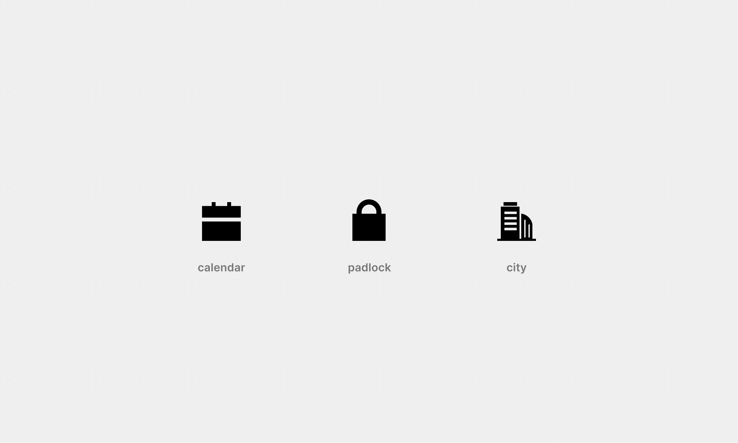
The icon system followed the same principle. Adaptable containers, predefined sizes, and product selectors allowed teams to switch between visual styles without recreating icon components for every brand.
Component Library
Components were designed around inheritance rather than isolated variants. Base patterns controlled shared structure and behavior, while product layers added the visual differences required by each brand.
This approach produced approximately 90% component inheritance. Updates to a shared base component could propagate through dependent components without requiring every product team to repeat the same work.
Documentation & Testing
Every component included implementation guidance, supported states, variable references, dependencies, and usage rules. Documentation was written for both designers and developers so the system could become a shared product language rather than a Figma only library.
Critical buttons and inputs were inserted into existing product mockups and tested through interactive Useberry prototypes. The tests found no significant usability issues and confirmed that the updated patterns remained clear inside real booking flows.
Legacy pages were migrated progressively whenever teams worked on them. This allowed the company to introduce the system without pausing active product development for a complete redesign.
Delivery Workflow
A cross team workshop and priority matrix defined which components should be delivered first. Developers selected components for each sprint, design prepared and documented them, implementation passed through Design QA, and the results were reviewed before the next iteration.
I organized the design work, priorities, estimates, and dependencies through a Gantt chart. Since a separate long term Jira project was unavailable, the system was managed inside one Epic with UX and UI subtasks connected to their related front end tasks.
Adoption & Learnings
Real product adoption exposed problems that could not be found inside an isolated component library. These cases helped improve both the system and the process around it.
Experimental Components
 Experimental Components
New and unvalidated forms were tested outside the system first. Only patterns that proved useful were documented and added to the shared library, which prevented experiments from becoming permanent system debt.
Documentation Gaps
 Documentation Gaps
As more teams started using the components, they found missing explanations and edge cases. These questions became direct input for improving documentation and implementation rules.
Timeline and Rollout
 Timeline and Rollout
Product priorities moved the original January 2024 target, but the initial system version was released in February 2024. Full deployment and active usage were reached within the following year.
Results
The Multiproduct Design System changed the relationship between design and development from repeated recreation to a shared, documented, and reusable product foundation.
ASAPTickets and SkyluxTravel were connected through the first implementation, while the architecture established a scalable base for an additional Trevolution product, future white label brands, and other LeadGen initiatives.
The system reached 98% component usage across the connected products and reduced the delivery of a new branded experience from 24 days to 4 days.
Months to complete the system MVP
Months to full deployment and active usage
Products fully connected in the initial rollout
Product environments covered by the architecture
Special thanks
Thank you for reading
If this catches your interest, we can work together ;)