Multi-product Design System Development
Multi-product Design System Development
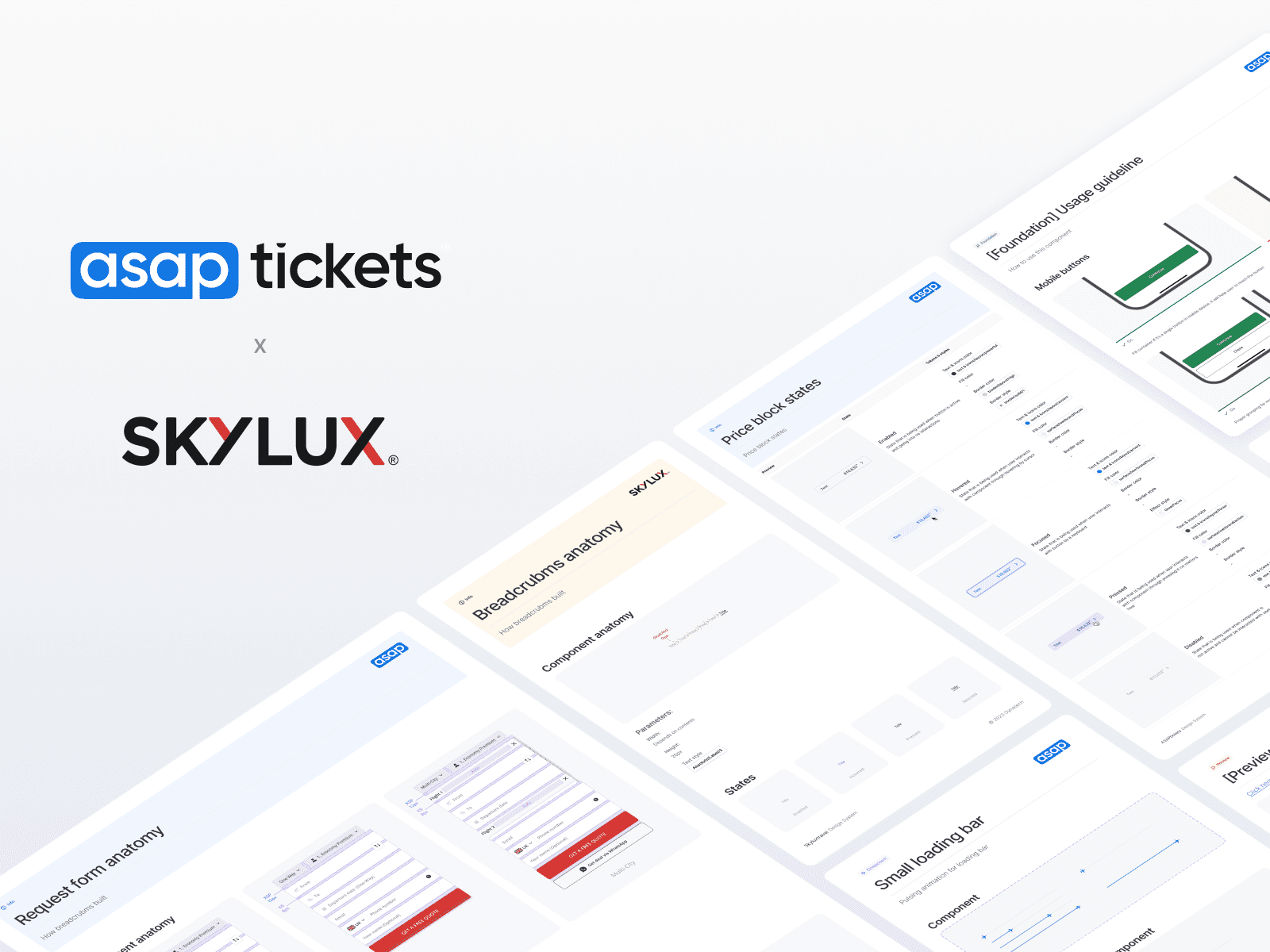
A design system that combines elements of three of the company's products
A design system that combines elements of three of the company's products
2023
2023
Role
Product Designer/Lead
Scope
UX/UI Design
UX/UI Design
Platform
Web
Web
About project
About project
At Trevolution Group we have two major products, ASAPTickets and SkyluxTravel, with TA (Travel Agency) model, operating without a structured design system, leading to inefficiencies in development, inconsistent UI, and a longer time-to-market for new features. To address this, we initiated the development of a comprehensive White Label Design System, ensuring scalability, consistency, and efficiency across multiple brands.
At Trevolution Group we have two major products, ASAPTickets and SkyluxTravel, with TA (Travel Agency) model, operating without a structured design system, leading to inefficiencies in development, inconsistent UI, and a longer time-to-market for new features. To address this, we initiated the development of a comprehensive White Label Design System, ensuring scalability, consistency, and efficiency across multiple brands.
Main Task & My Role
Main Task & My Role
I led the design system initiative, working closely with my colleague from SkyluxTravel, ensuring alignment between both products while also modernizing legacy ASAPTickets components. A key part of this process involved collaborating with Tech Lead, Development team, and Head of LeadGen Products to ensure smooth adoption and seamless integration into the company’s workflow.
Beyond UI standardization, we focused on scalability, structuring the system to support future brands and projects. Additionally, I facilitated documentation, implementation strategy, and team education, ensuring that the design system became a core foundation for design and development.
Project outcome
Project outcome
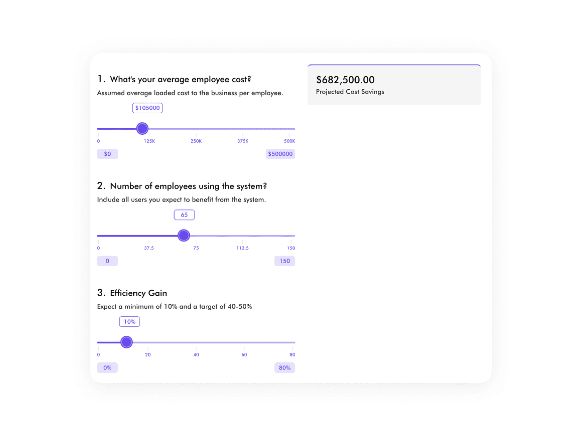
Optimized development efforts, saving the company at least $600K per year.
Reduced time-to-market for new designs from 24 days to just 4 days.
Completed the MVP of the design system within 6 months, with full deployment and active usage achieved within a year.
Built a scalable White Label Design System with complete documentation and reusable components, enabling seamless expansion across new brands and LeadGen projects.
Related products
Related products
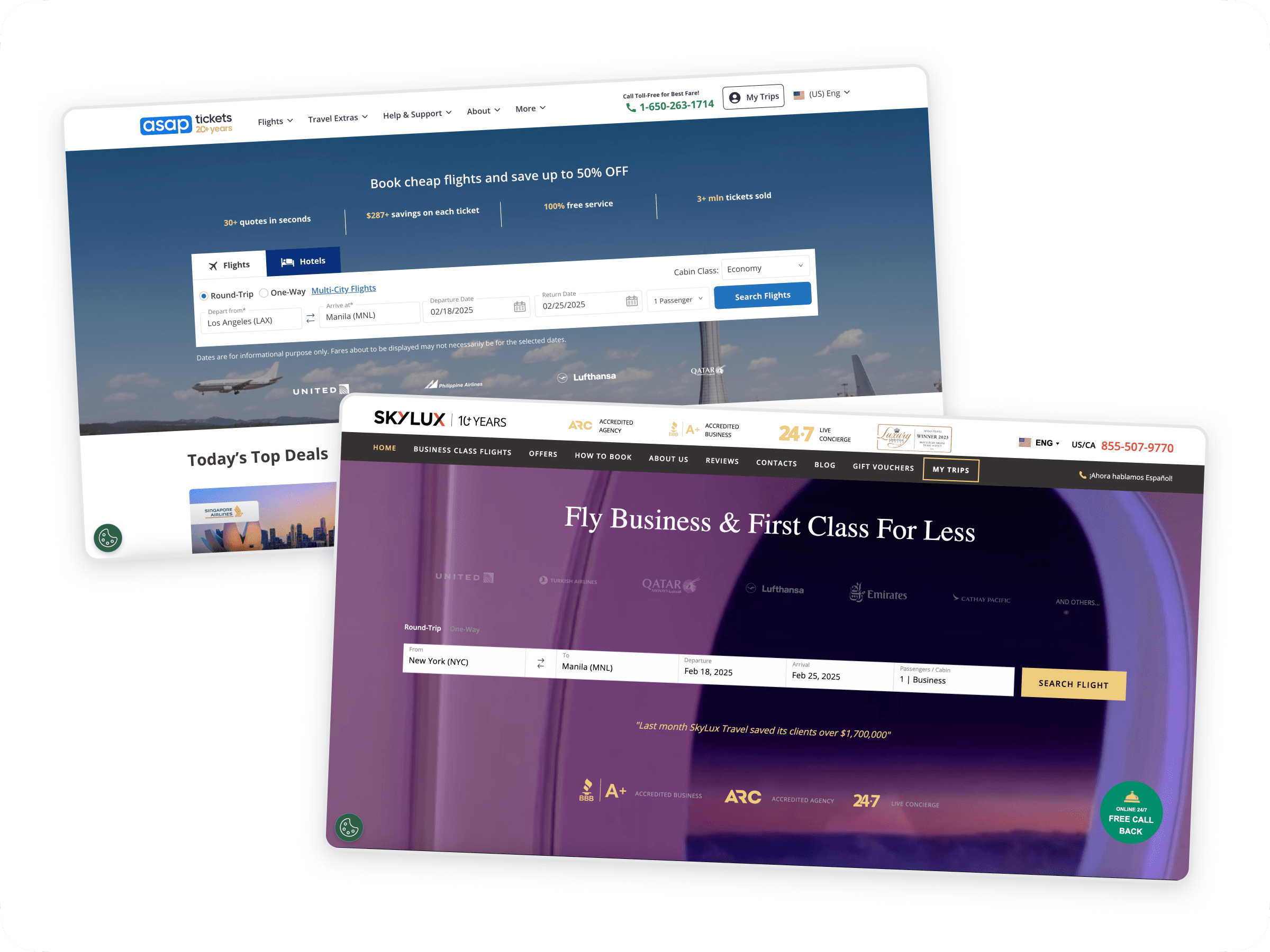
ASAPTickets and SkyluxTravel are the two primary revenue-generating products of Trevolution Group, both operating under a shared business model while targeting distinct audiences. Despite their differences in branding and pricing, their core structure, booking logic, and backend systems are fundamentally similar, making them ideal for a unified White Label Design System.
At ASAPTickets, users search for flights on the website and submit a request. They then receive a call from an agent who helps them finalize the booking. A personalized link is sent via email, leading to a page where they can review details and complete the purchase. This product is designed for a budget-conscious audience aged 35-60, many of whom prefer agent assistance due to concerns about making costly booking mistakes. Given that the average ticket price is around $2400, users are looking for the best possible deal with minimal risk.
SkyluxTravel, on the other hand, follows the same booking flow but focuses on a premium audience (40-55 years old) seeking business and first-class flights as it says on it's name ;) . The pricing is significantly higher, and the service expectations differ—users expect a concierge-like experience with a higher level of personalized service.
Service rough diagram:

The Need for a New Design System
The Need for a New Design System
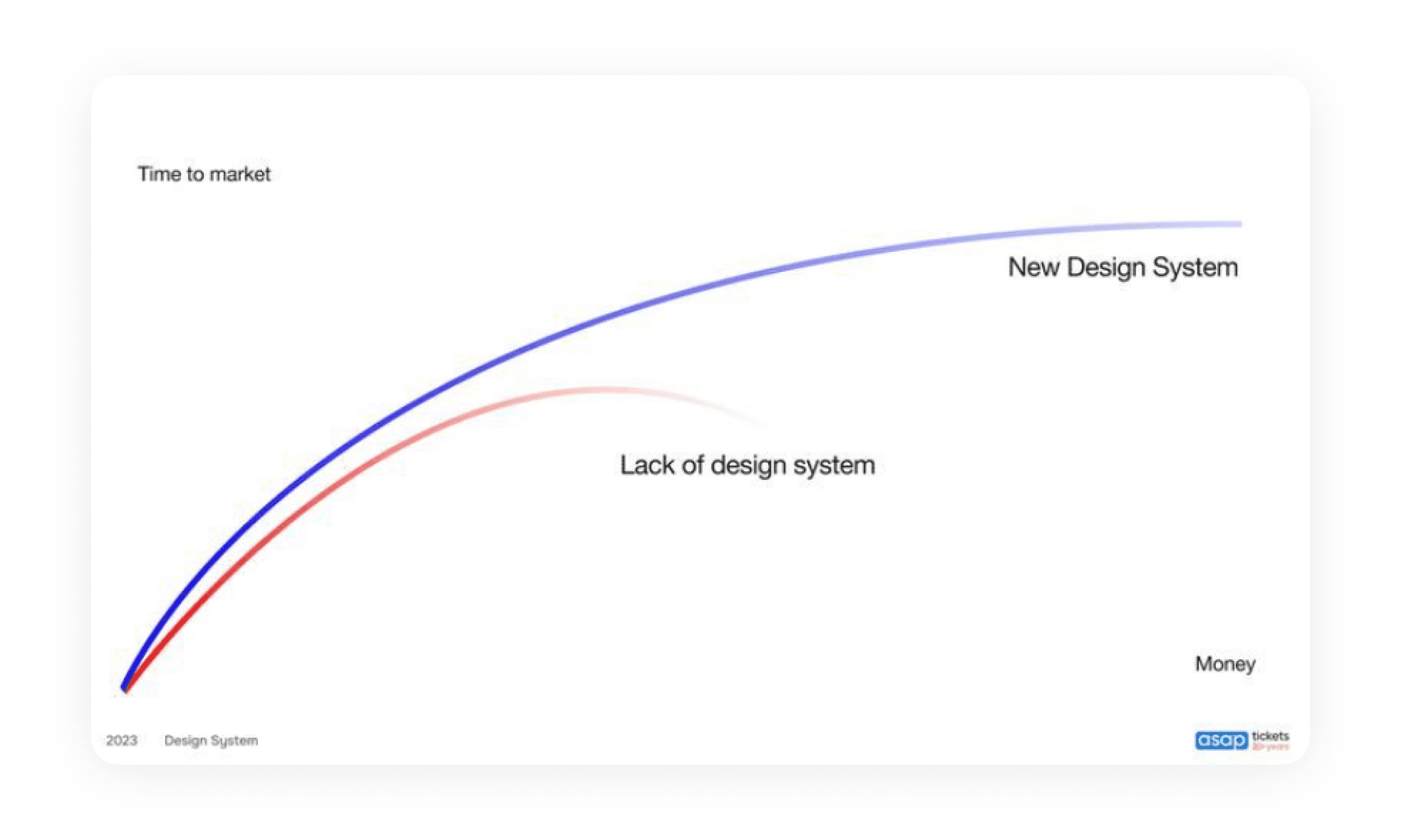
When I joined the company in 2023 and started analyzing how projects were executed, I noticed a fundamental inefficiency—design and development lacked consistency. Designers and developers were building pages without a structured system, leading to redundant work and extended timelines. For example, each time a developer encountered a button in Figma, they would code it from scratch, repeating this process across multiple instances instead of using a standardized component.
This fragmented approach significantly slowed down development. In May 2023, the average time-to-market for new features at ASAPTickets and SkyluxTravel was 23 days after designers handed over their mockups. It was clear that such inefficiencies had a direct impact on business revenue, delaying the launch of new initiatives and limiting growth opportunities.
It’s important to highlight that this project primarily focused on front-end design standardization, not backend development. By fixing inconsistencies on the front end through a structured design system, we could drastically reduce time-to-market and optimize development efforts, ensuring a faster, more scalable workflow without requiring backend overhauls.
Analysis insights
Analysis insights
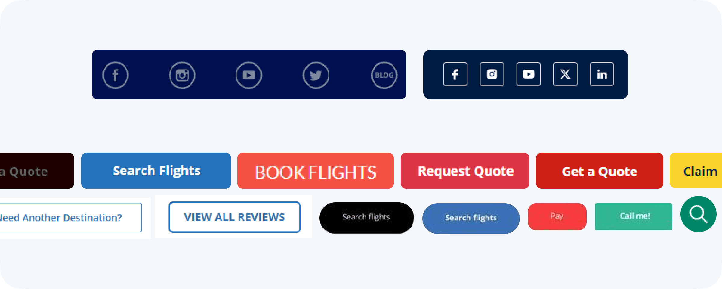
Before implementing a design system, we first needed to assess the scale of the inconsistencies and set a clear goal: reducing, not increasing, development time. To quantify the issue, we asked developers to consolidate all existing UI components into a single repository, categorizing them into elements like buttons, avatars, input fields, and radio buttons. The results revealed a fragmented and redundant codebase, where multiple variations of the same components existed across different parts of the product. For example, here is a snapshot of how buttons were implemented in ASAPTickets before the design system was implemented:
Before implementing a design system, we first needed to assess the scale of the inconsistencies and set a clear goal: reducing, not increasing, development time. To quantify the issue, we asked developers to consolidate all existing UI components into a single repository, categorizing them into elements like buttons, avatars, input fields, and radio buttons. The results revealed a fragmented and redundant codebase, where multiple variations of the same components existed across different parts of the product. For example, here is a snapshot of how buttons were implemented in ASAPTickets before the design system was implemented:
In collaboration with the Tech Lead, we mapped out key areas for improvement, estimating how a structured design system could eliminate chaos and accelerate development. While we already had experience building design systems in previous roles, our challenge was presenting the business case convincingly to secure resources for its implementation.
In collaboration with the Tech Lead, we mapped out key areas for improvement, estimating how a structured design system could eliminate chaos and accelerate development. While we already had experience building design systems in previous roles, our challenge was presenting the business case convincingly to secure resources for its implementation.
Presenting the Business Case to Stakeholders
To gain buy-in, we outlined a roadmap defining the structure of components, atoms, and variables, along with a rough implementation timeline. A key part of the proposal was calculating the ROI of the design system, demonstrating the financial and operational benefits.
Special thanks to our Design Director Michael Browk, who played a crucial role in justifying the importance of the design system through a compelling business presentation.
We created a detailed presentation highlighting the financial impact, including a breakdown of how a design system would reduce costs, improve efficiency, and accelerate feature deployment. One of the key slides illustrated how standardizing components would directly contribute to the company’s bottom line by reducing redundant development work and shortening time-to-market.
We created a detailed presentation highlighting the financial impact, including a breakdown of how a design system would reduce costs, improve efficiency, and accelerate feature deployment. One of the key slides illustrated how standardizing components would directly contribute to the company’s bottom line by reducing redundant development work and shortening time-to-market.
With a data-driven approach, we successfully demonstrated that investing in a design system was not just a design decision but a strategic business move, ultimately securing stakeholder support and the necessary resources for implementation.
With a data-driven approach, we successfully demonstrated that investing in a design system was not just a design decision but a strategic business move, ultimately securing stakeholder support and the necessary resources for implementation.
With a clear vision of the impact a design system could have on efficiency, we demonstrated that its implementation would significantly accelerate project delivery in the future. As a result, we secured stakeholder approval and officially began work at the end of summer 2023.
Our process followed a structured approach to ensure both design and technical feasibility:
Gathering requirements
Discussing technical details with development team
Creating Design components
Usability testing (AI Help included)
Documentation
Development and Design QA
Design system concept & structure
When we began planning the design system, we focused heavily on tokenization and cross-product compatibility, ensuring that components could be easily adapted between multiple company products. However, a major challenge was that, at the time, token management for designers relied entirely on third-party tools and Figma plugins. This meant that each element required significantly more documentation, often two or three times more than usual, and needed extensive validation to prevent potential errors.
As we were finalizing our implementation plan, Figma announced a major update, introducing native variable support and an improved developer mode. This announcement reshaped our approach initially delaying our timeline by a few months but ultimately streamlining our workflow and accelerating the system’s development.
In my role as the lead strategist and manager of the design system, I took a two-week deep dive into Figma’s new documentation, tokenization principles, and developer mode, mapping out a new structural framework and comparing it to our previous iterations. I presented these findings to the Design Director and key stakeholders whose products would eventually integrate with the system. After a series of collaborative meetings, we finalized a new structure and operational model, ensuring that the design system was both scalable and future-proof.
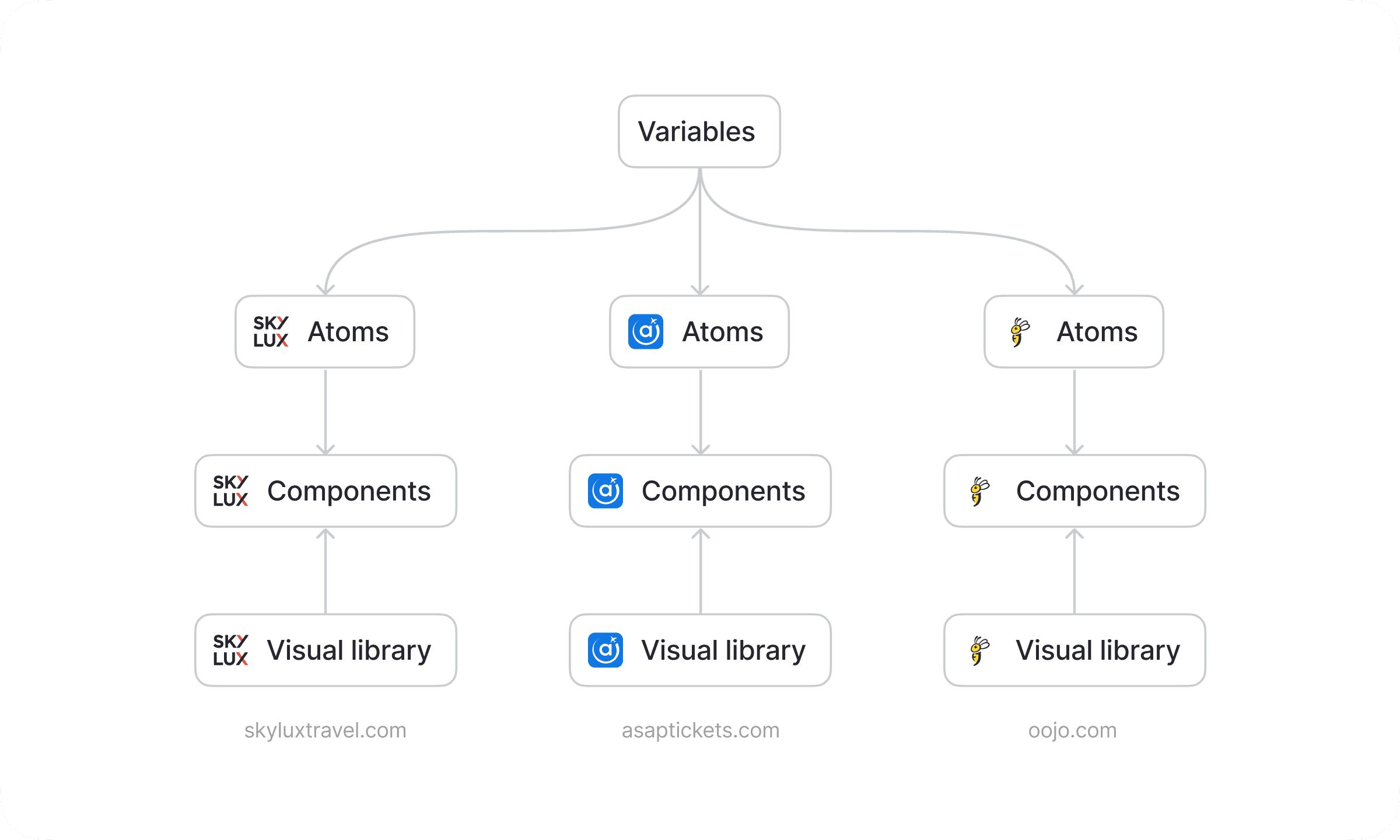
Design System's Structure:
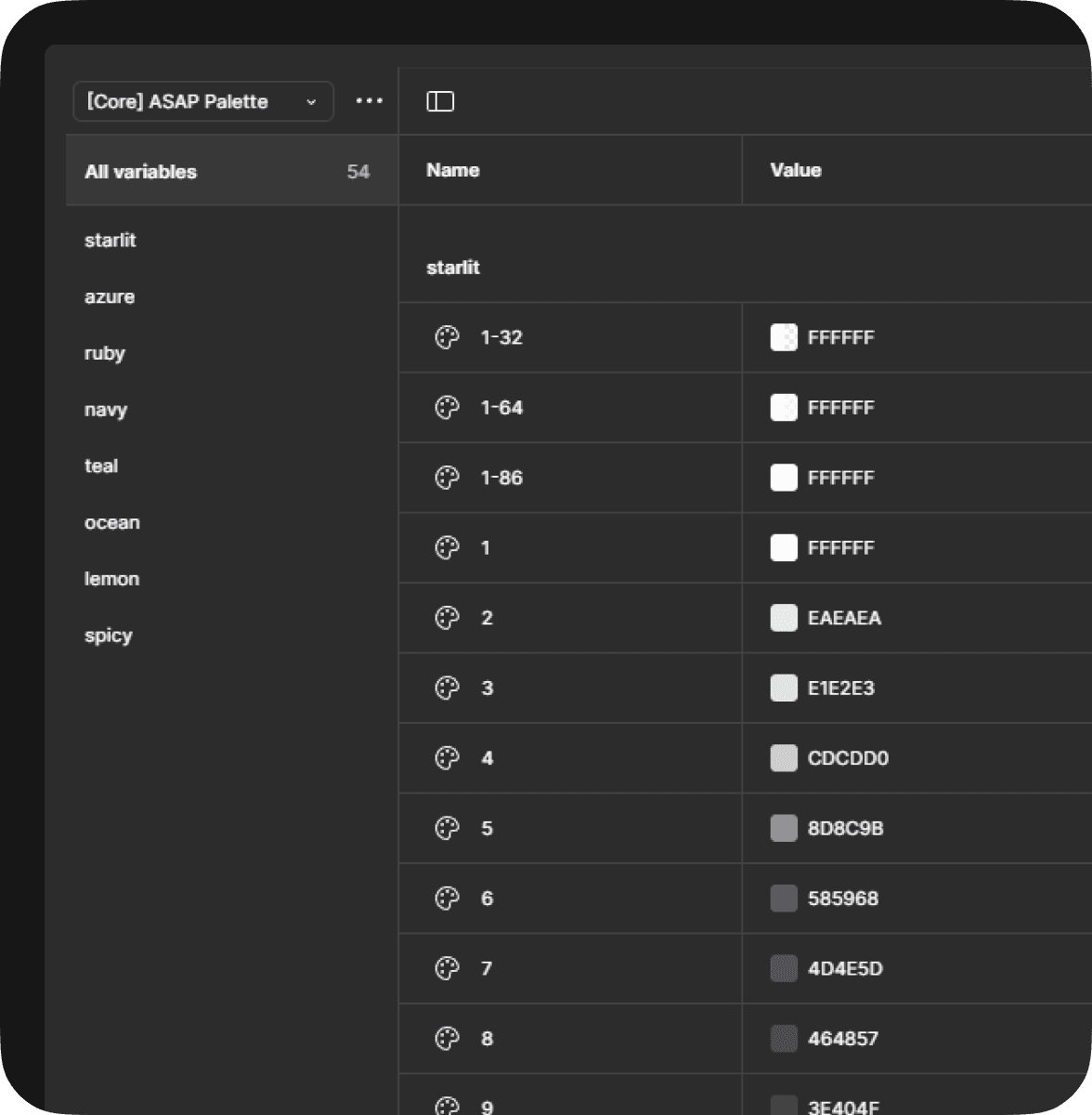
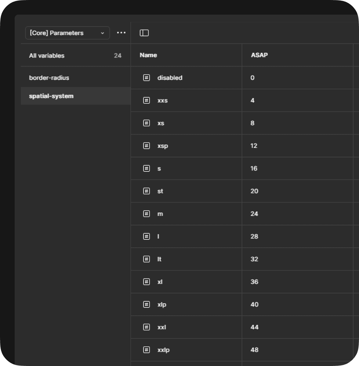
Variables – The core file of the design system, shared across all products. It stores color variables, palettes, spacing, sizing, and border-radius values, ensuring visual consistency.
Foundation (Atoms) – A dedicated file for each product, maintaining a standardized naming convention and structure. It includes typography, effects, grid systems, overlays, and border styles to establish a strong design foundation.
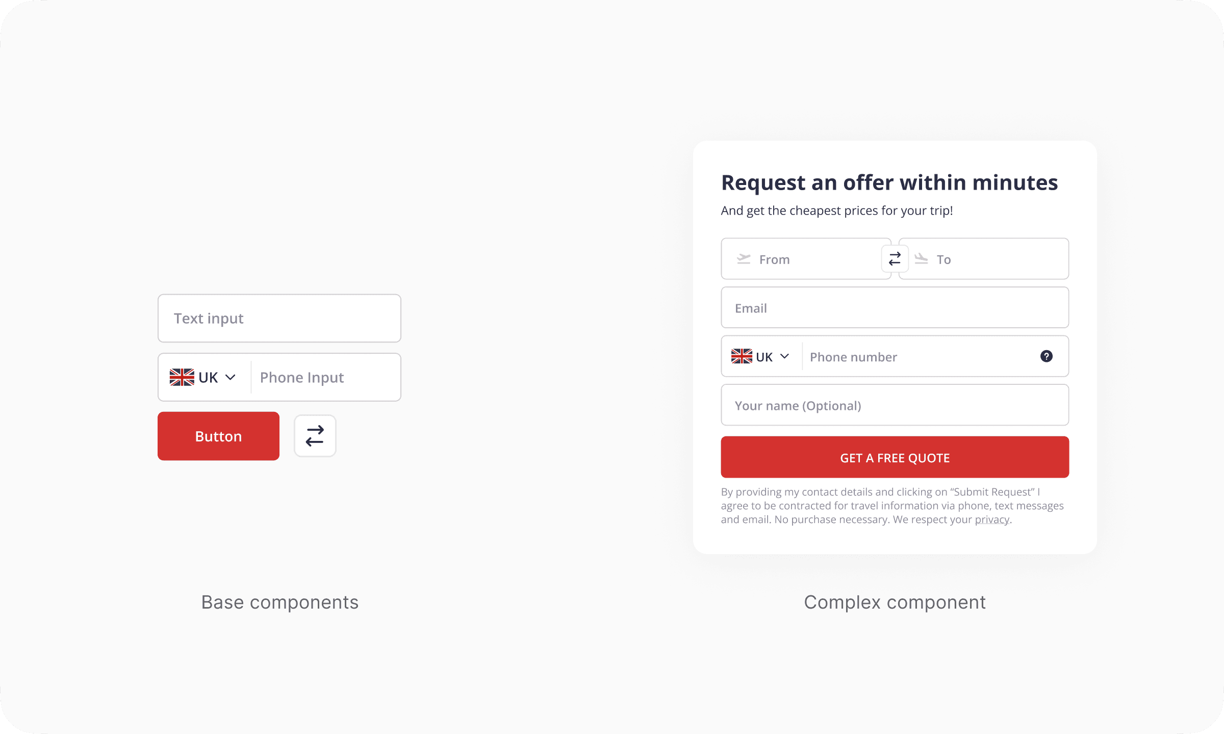
Components – The main component library for each product, stored in a separate file for modularity. It is structured into basic components (buttons, inputs), complex components (cards, dropdowns), and larger UI sections (modals, page sections).
Visual library – A separate file containing all visual assets for each product, including icons, images, and illustrations, ensuring consistency in branding and UI elements.
Design System's Structure:
Variables – The core file of the design system, shared across all products. It stores color variables, palettes, spacing, sizing, and border-radius values, ensuring visual consistency.
Foundation (Atoms) – A dedicated file for each product, maintaining a standardized naming convention and structure. It includes typography, effects, grid systems, overlays, and border styles to establish a strong design foundation.
Components – The main component library for each product, stored in a separate file for modularity. It is structured into basic components (buttons, inputs), complex components (cards, dropdowns), and larger UI sections (modals, page sections).
Visual library – A separate file containing all visual assets for each product, including icons, images, and illustrations, ensuring consistency in branding and UI elements.
Gathering requirements
To build a structured and scalable design system, we first needed to define key components and patterns that would serve as the foundation. Working closely with developers, product managers, and designers, we compiled an initial list of components to kickstart the development process. This collaboration ensured that the system would address both design consistency and technical feasibility from the start. And we organized a cross-team workshop using this priority matrix:
To build a structured and scalable design system, we first needed to define key components and patterns that would serve as the foundation. Working closely with developers, product managers, and designers, we compiled an initial list of components to kickstart the development process. This collaboration ensured that the system would address both design consistency and technical feasibility from the start. And we organized a cross-team workshop using this priority matrix:

We structured our workflow using the following approach:
✂️ Dividing components into iterations
Design and Development team agreed to divide components into iterations based on their importance and complexity.🏃 Choosing components for each sprint
At the start of every sprint, developers selected specific components to develop or update during the sprint.🔬 Design QA
The Design team tests and reviews the updated components to ensure it met both visual standards and user expectations before moving forward.🏗️ Implementation of updated components
Once approved, the updated components are implemented into the product and become available to users.💼 Evaluation of Effectiveness and Impact
After Implementation we assessed how well the components improved usability and efficiency ensuring they aligned with the original design system goals.♻️ Iterative process
Component development followed an iterative model, allowing for continuous feedback, refinements and optimizations. As new components were released, the cycle of analysis, planning and enhancements ensured that the design system evolved with the product's needs.
System's overview

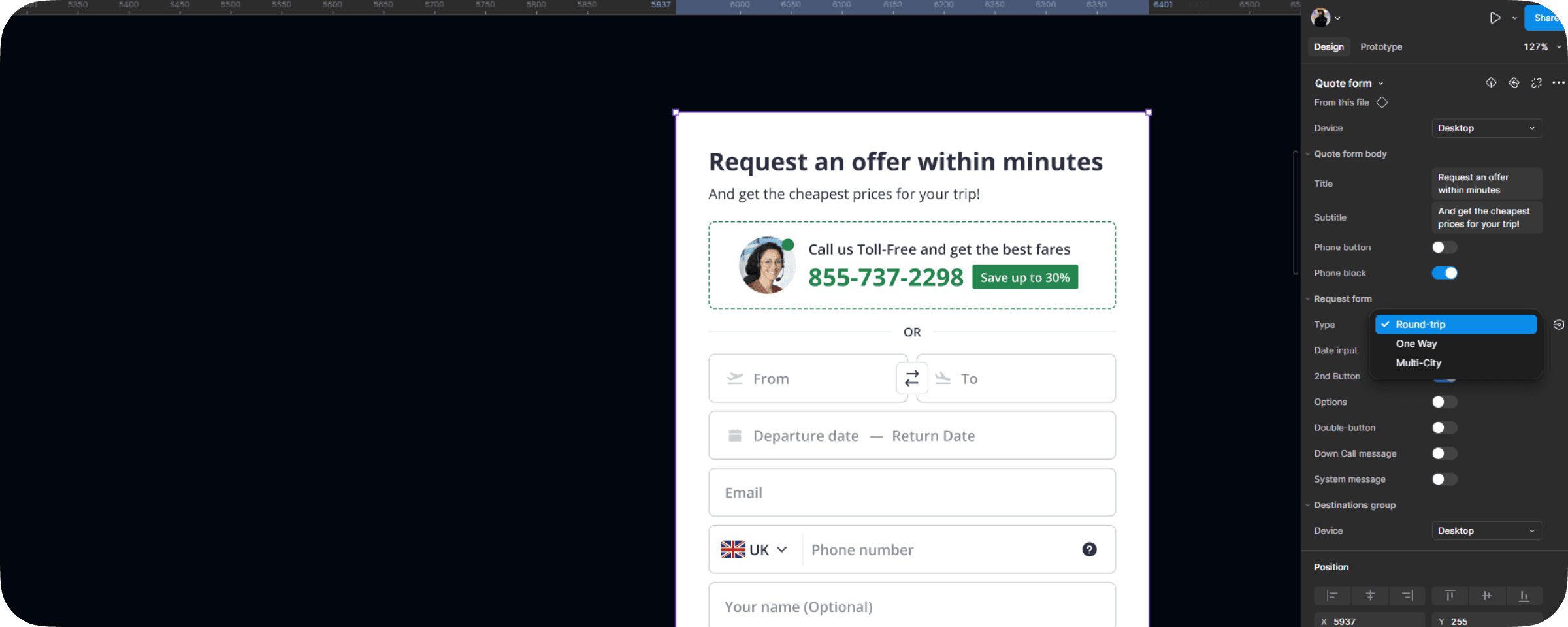
The main idea behind our system to create a single component and change it with help of tokens in every product. At the moment only 2 products are fully connected to this system - ASAPTickets and SkyluxTravel but we also have ambitious plans to connect Vagamo, Oojo and Triplicity.
The main idea behind our system to create a single component and change it with help of tokens in every product. At the moment only 2 products are fully connected to this system - ASAPTickets and SkyluxTravel but we also have ambitious plans to connect Vagamo, Oojo and Triplicity.
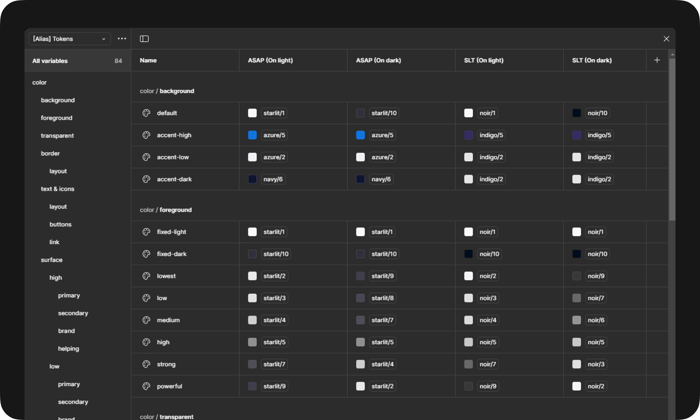
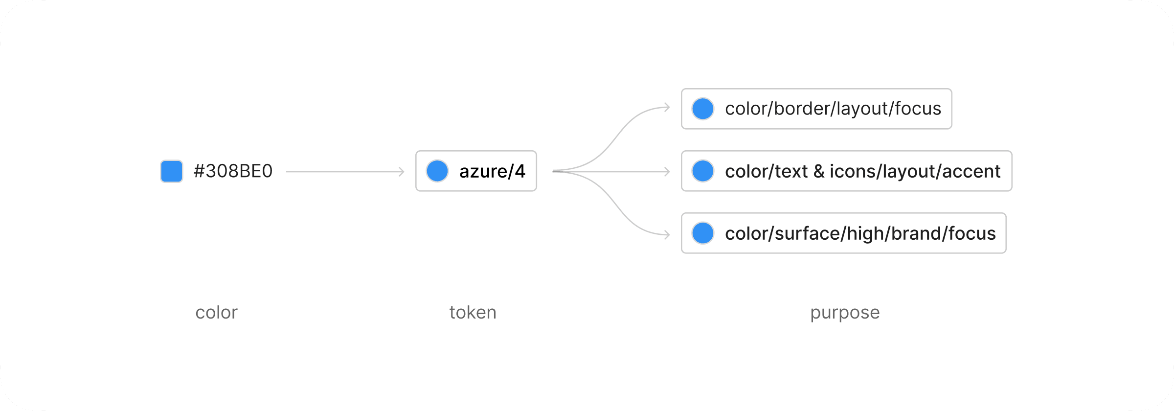
Since ASAPTickets and SkyluxTravel share a similar structure and business model, we decided to build a unified token system within the Variables Library, allowing for efficient cross-product management. This approach enabled us to maintain a shared foundation while creating project-specific aliases based on the core variables.
Since ASAPTickets and SkyluxTravel share a similar structure and business model, we decided to build a unified token system within the Variables Library, allowing for efficient cross-product management. This approach enabled us to maintain a shared foundation while creating project-specific aliases based on the core variables.
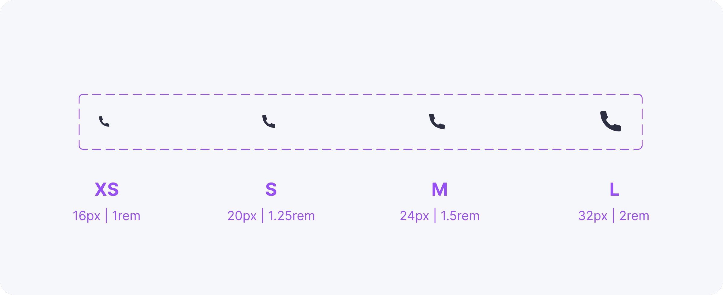
Icons are a crucial part of the design system, as they also vary depending on the product. To ensure flexibility and consistency, I implemented an efficient icon management solution. Instead of creating separate icon sets for each product, I designed a container-based system that adapts dynamically.
The container includes multiple predefined sizes, ensuring compatibility across all products. Inside this container, we use an icon selector, where each product has a specific index assigned to its icons. This means that switching an icon to match the style of ASAPTickets or SkyluxTravel is as simple as adjusting its index.
This approach allows for seamless integration within any component, enabling fast customization and scalability while maintaining a cohesive visual identity across different brands.
System Scalability & Inheritance
System Scalability & Inheritance
Our design system is built with approximately 90% component inheritance, ensuring a high level of consistency and efficiency across products. Every complex component within the system contains at least one base component, creating a structured and modular approach to UI design.
This hierarchical structure significantly simplifies global updates for both designers and developers. When a base component is updated, the changes automatically propagate across all dependent components, reducing redundant work and ensuring visual and functional consistency across the entire product ecosystem.
This approach not only enhances scalability but also streamlines design handoffs, implementation, and long-term maintenance, making the system more adaptable and future-proof.


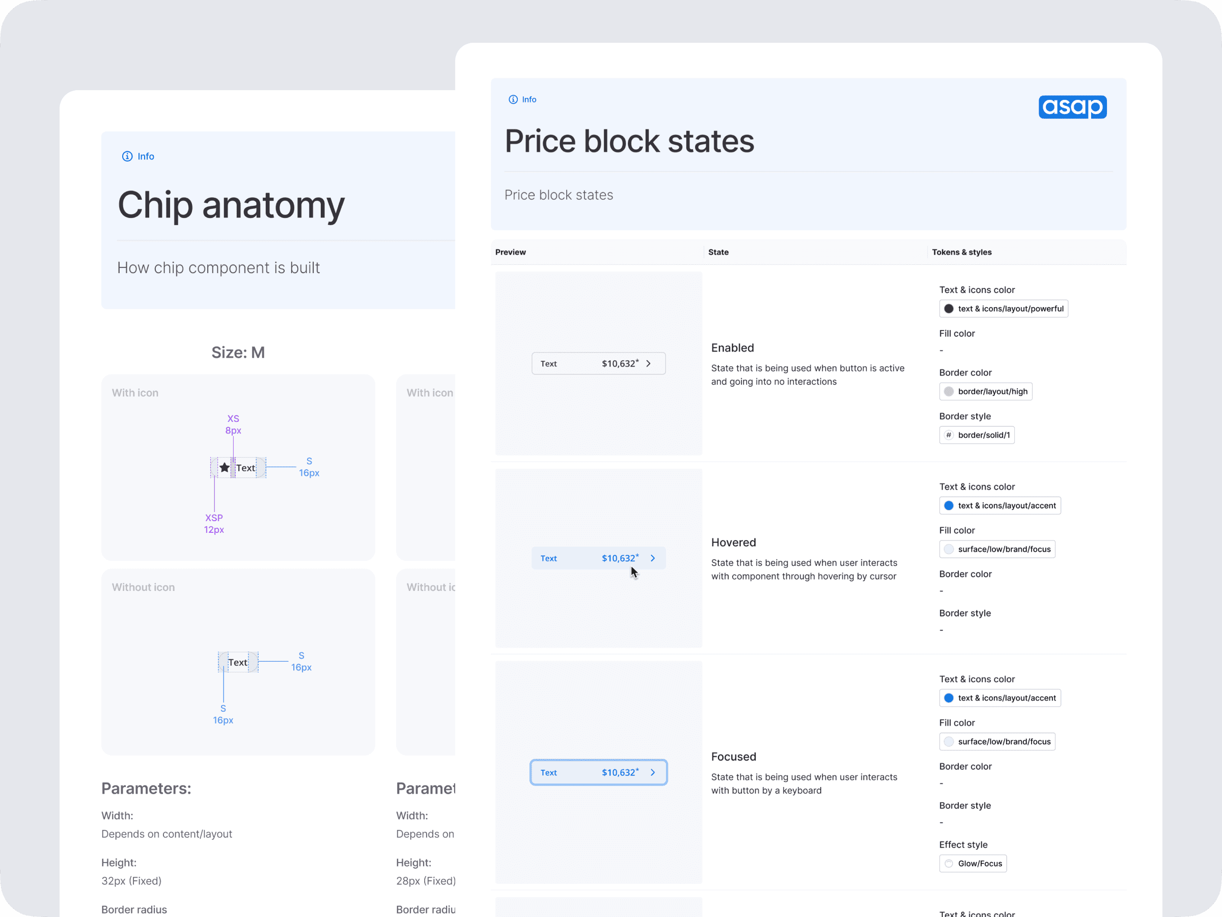
Documentation
From the very beginning, we prioritized clear and user-friendly documentation to ensure seamless collaboration between designers and developers. Through continuous communication, we established a structured approach to documenting component functionality, setting a standard for clarity and usability.
From the very beginning, we prioritized clear and user-friendly documentation to ensure seamless collaboration between designers and developers. Through continuous communication, we established a structured approach to documenting component functionality, setting a standard for clarity and usability.

Our documentation not only explained how to correctly implement each component but also detailed all possible states, underlying atoms, and associated variables. This ensured that both design and development teams could easily understand the system and apply it consistently.
Our documentation not only explained how to correctly implement each component but also detailed all possible states, underlying atoms, and associated variables. This ensured that both design and development teams could easily understand the system and apply it consistently.
While some sections might have been more detailed than strictly necessary, we remained committed to creating a comprehensive, well-structured, and accessible guide. Our goal was to provide a truly convenient and understandable resource, making the design system efficient, scalable, and easy to adopt across teams.
While some sections might have been more detailed than strictly necessary, we remained committed to creating a comprehensive, well-structured, and accessible guide. Our goal was to provide a truly convenient and understandable resource, making the design system efficient, scalable, and easy to adopt across teams.
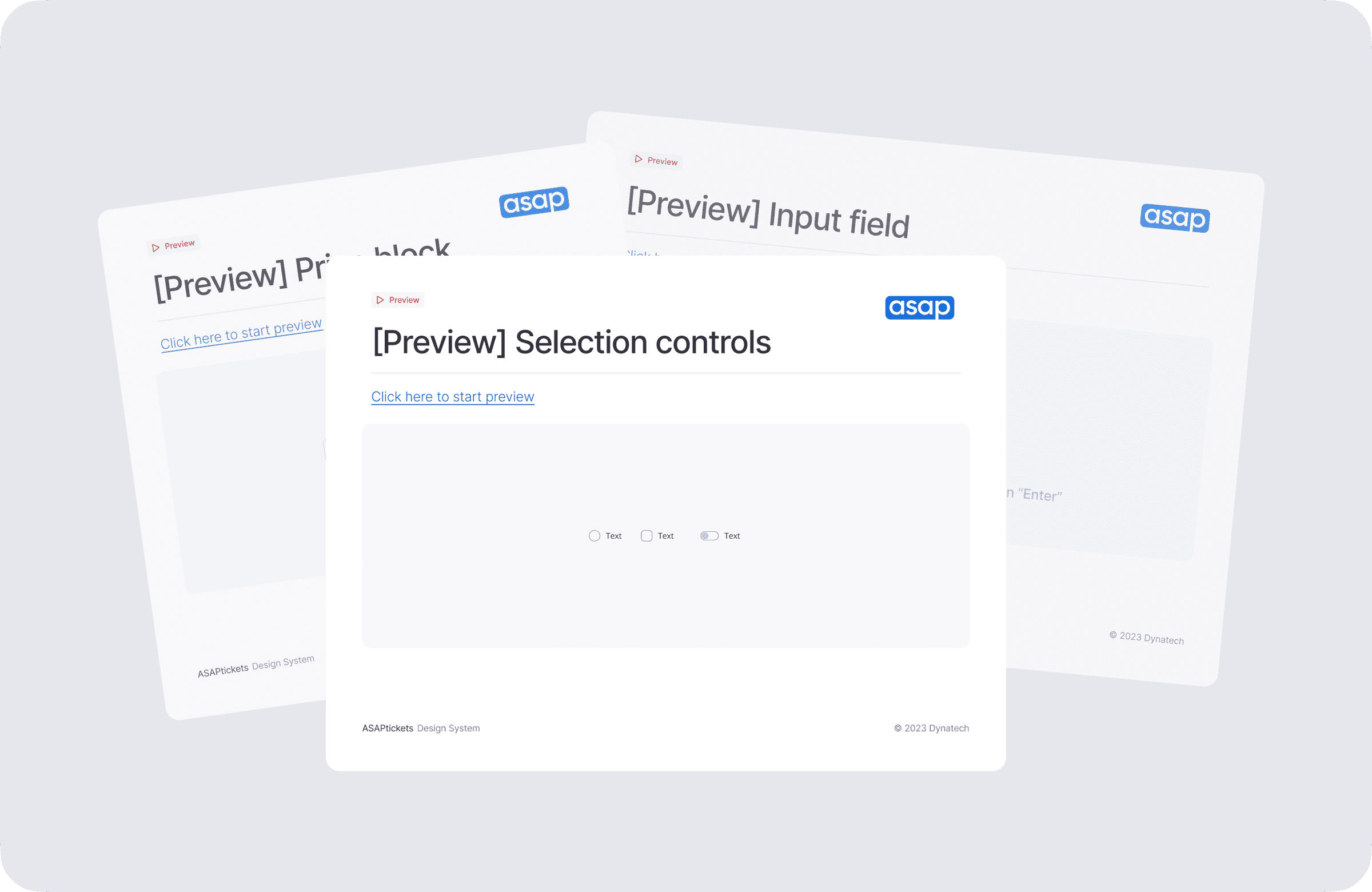
Usability testing

We tested our new components by integrating buttons and input fields into existing mockups and creating interactive prototypes. Using Useberry, we gathered real user feedback to ensure the updates worked as well as or better than previous versions. The results confirmed that users had no significant issues, proving that our design decisions improved usability and consistency without disrupting the experience.
We tested our new components by integrating buttons and input fields into existing mockups and creating interactive prototypes. Using Useberry, we gathered real user feedback to ensure the updates worked as well as or better than previous versions. The results confirmed that users had no significant issues, proving that our design decisions improved usability and consistency without disrupting the experience.
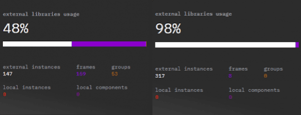
Development results
Thanks to the effort of our development team, the transition to the new design system was smooth and free of major technical issues. Today, 98% of components used across projects come directly from the new system.
Thanks to the effort of our development team, the transition to the new design system was smooth and free of major technical issues. Today, 98% of components used across projects come directly from the new system.
The most demanding part of the process was migrating old pages to the new system in Figma and development, but we incorporated this into our workflow, gradually replacing legacy components step by step.
Some pages still contain older components, but as soon as updates are needed, they are immediately transitioned to the new design system, ensuring continuous improvement and long-term consistency.
Project Planning & Management
The planning process for the design system didn’t take too long, but it was far from easy. One of the biggest challenges was the organizational changes within the company at the time. As we transitioned to new software, project management tools, and methodologies, it became difficult to adapt to evolving workflows, especially with multiple teams working on the system simultaneously. To stay aligned, we decided to leverage standard project management tools used across different teams.
I was responsible for structuring and organizing tasks for the design team, including their prioritization, documentation, and time estimation within our Gantt Chart. Unfortunately, we couldn't fully integrate our workflow into developer sprints due to fundamental differences in how tasks were handled and tracked in Kanban.
Since creating a separate long-term Jira project for the design system wasn't feasible at that moment, we opted for a simple, linear workflow by managing everything within a single Epic in Jira. While this structure may not have been perfect, it effectively met the immediate needs of both the design and development teams, ensuring smooth collaboration without overcomplicating the process.
Here is the simple approach we used:
Here is the simple approach we used:

Since we had no possibility to connect Epics to each other, we've decided to connect each UX/UI Sub-Task to Related task in Front-End Project.
Since we had no possibility to connect Epics to each other, we've decided to connect each UX/UI Sub-Task to Related task in Front-End Project.
Problems encountered
🚩 Experiments with New Forms
During landing page experiments, developers faced challenges in quickly testing new form structures because they required additional implementation within the design system. To maintain agility, we decided to skip design system integration during the experimentation phase. Once an experiment proved successful, the new component was officially added to the design system for future use.
🚩 Cross-Team Communication Issues
When extending the design system to another project, we encountered unexpected gaps in documentation. Developers needed clearer guidance on integrating the system into their workflows. Recognizing this, we rapidly addressed the issue, refining documentation to ensure seamless adoption across teams.
🚩 Deadline Challenges
Initially, we aimed to complete the design system by January 2024, having started in Summer 2023. However, due to shifting priorities and other high-impact projects, progress was delayed. Despite these challenges, we successfully released the initial version of the design system in February 2024, ensuring a fully functional and scalable foundation for future improvements.
Special thanks to my colleagues that helped with the design system:
Special thanks to my colleagues that helped with the design system:

Interested in cooperation?
Contact me:
grabbed.pass@gmail.com
Personal website of Artem Udovichenko
Last Update: January 1, 2025
Interested in cooperation?
Contact me:
grabbed.pass@gmail.com
Personal website of Artem Udovichenko
Last Update: January 1, 2025